Pantastico Case Study
Role
UX/UI Designer bringing the Pantasico vision to life! Designing the app from conception to delivery.
Responsibilities
- UX Research, interviews & usability studies
- Creating paper and digital wireframe, low and high-fidelity prototypes
- Accounting for accessibility, and iterating on designs
- UI Design decisions, branding, logo & icon design
Project Overview
The Background
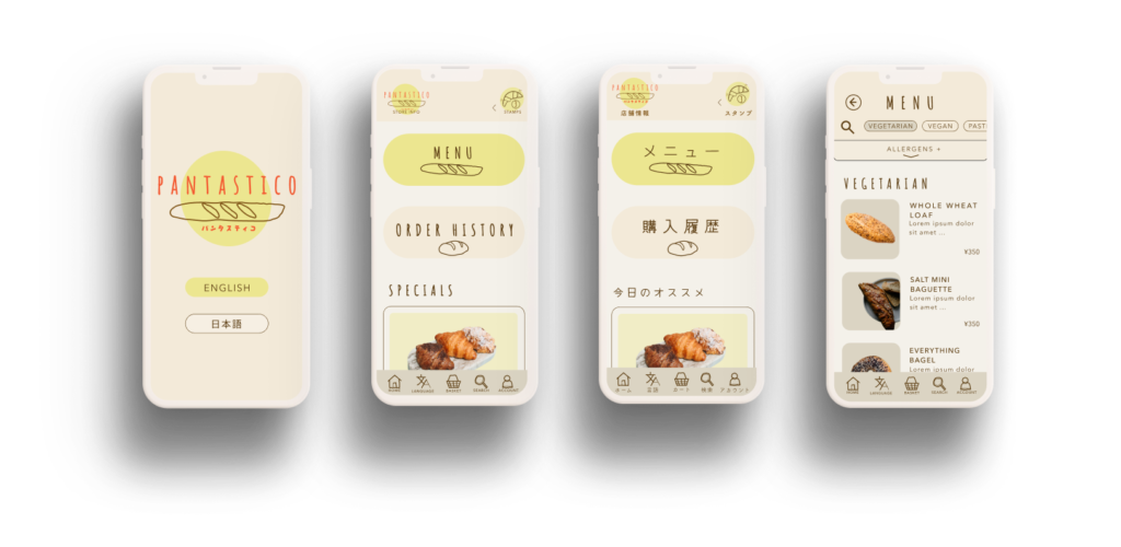
Pantastico is a local bakery in Tokyo, Japan. They want to engage technology to make their products and experience more welcoming for an increasingly diverse customer base.
We are creating a bilingual app which allows customers to easily view the ingredient and allergen information of menu items in their preferred language and order remotely for efficient pickup from the Pantastico counter.
The Challenge
- Design an approachable, bilingual app for familiar and unfamiliar users
- Allow users to easily access dietary, allergen and ingredient information
- Allow for order and pick up of delicious baked goods in selected language for a joyful ordering experience without lines or in-store waits
- Facilitate engagement and growth for Pantastico through in-app rewards and reduced language barriers to entry
Understanding the User
Research
Summary
I wanted to know the story of users I’m designing for and really come to empathise with their needs. It’s easy to think we know what others are experiencing but it was important to me to work not from assumptions but from the words and insights of the users themselves.
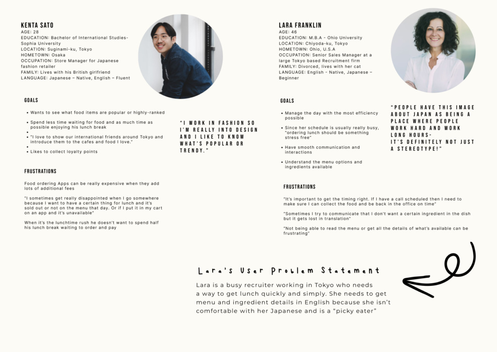
I conducted interviews and created empathy maps to understand the primary user group. They were identified through the research as working adults with time-constrained lunch breaks. Japanese and non-Japanese living and working in Tokyo.
This user group confirmed initial thoughts we had about Pantastico’s customers’ desire for a bilingual experience, but research also revealed that saving time and making informed dietary decisions about the ingredients and potential allergens were also a big concern for users in deciding where and what to eat.
Time
Users often had to wait in line during peak times such as the lunchtime rush to order and were losing time they could be enjoying their break
Language
Non-native users often felt stressed and overlooked, finding it hard to get the information they needed in their own language.
They often felt intimidated when having to navigate difficult in-person interactions
Diet & Allergens
Users were often frustrated by not knowing what exactly was in their food.
Those with allergies and dietary preferences said they were often at a loss when looking for the necessary information to make informed decisions
Meet the Users
Journey Mapping
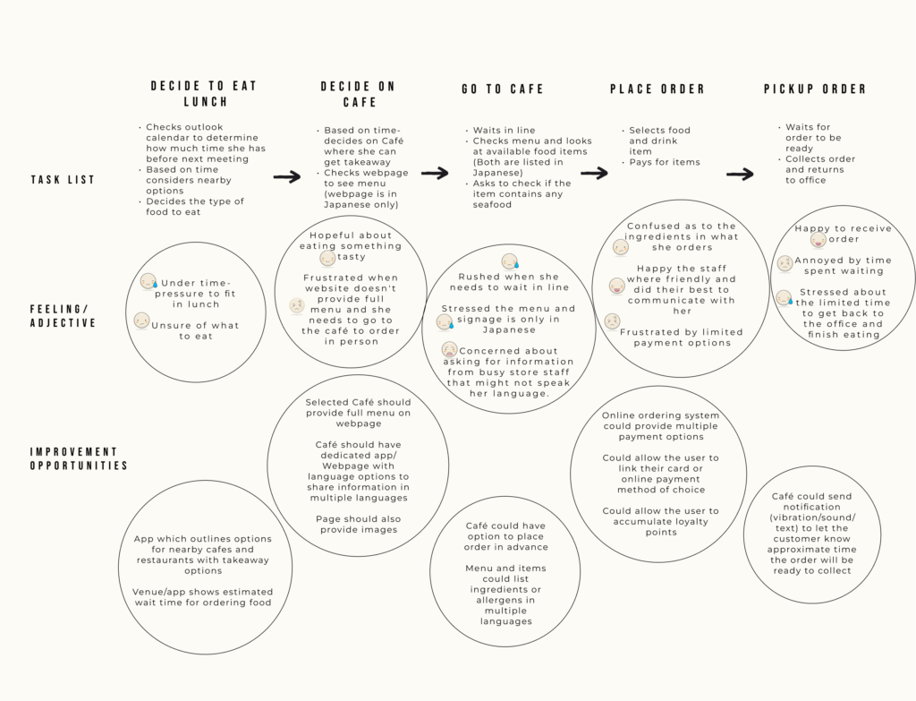
Lara's User Journey Map
Goal: Order and pay for takeaway lunch
User story: As a self proclaimed “picky-eater” and busy working woman with tight lunch schedule, she wants to check the menu in her chosen language, order and pay in advance so she can save time and have a more relaxing lunch break.
Findings
Mapping Lara’s user journey revealed many opportunities to improve her experience of ordering lunch. It revealed that the dedicated Pantastico App could prove helpful for users in addressing pain points related to Language & Communication, Diet and Time.
Starting the Design
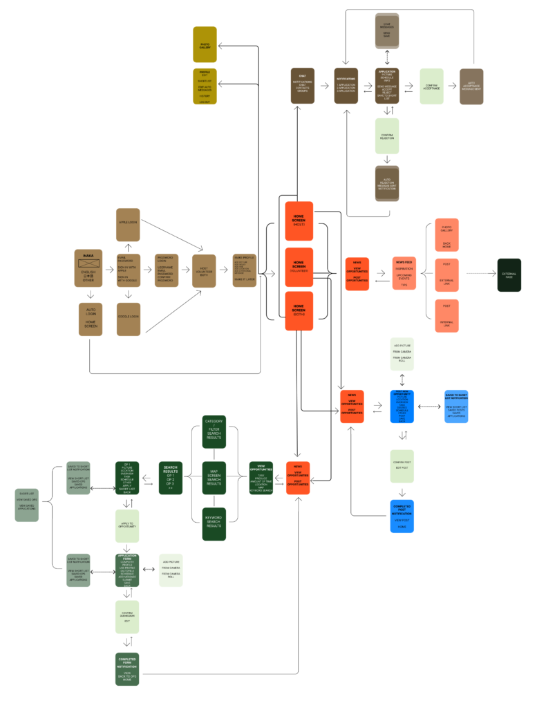
Mapping
Paper Wireframes
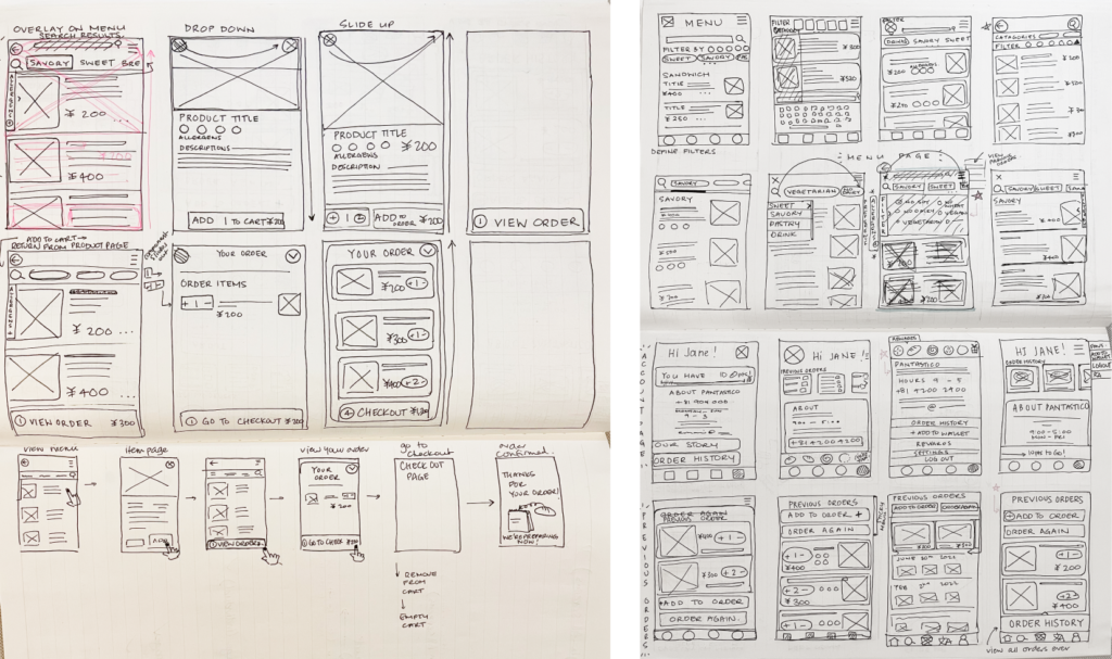
In the initial wireframes I was exploring ways to present the information directly and simply to address pain points from the moment the user downloads the app.
For example
- Having the language options available from the menu at any time
- Providing access to Order History to quickly re-order from the Home Screen
- Icons and filters to simplify searches for users with allergies and dietary concerns from the Menu Page
Digital Wireframes
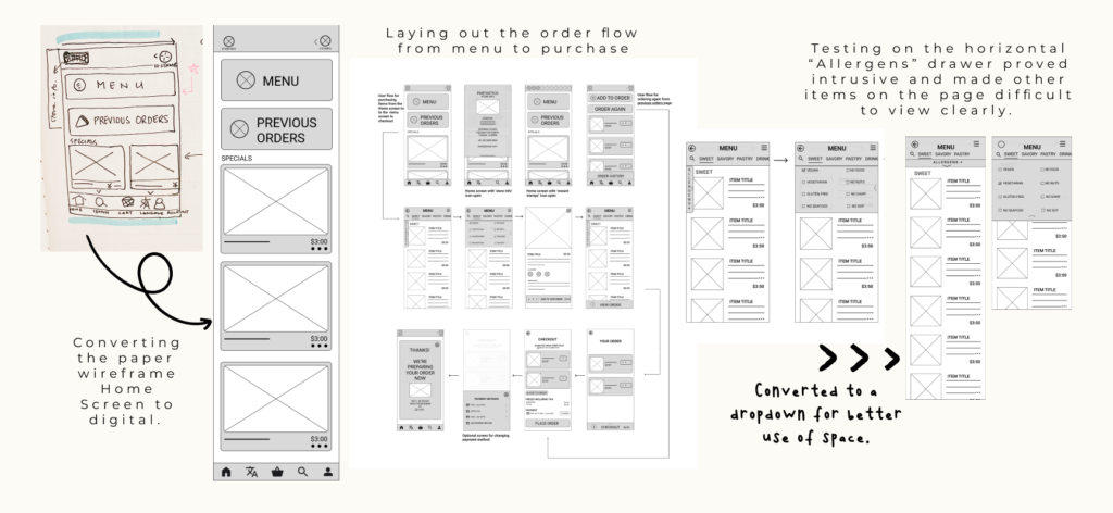
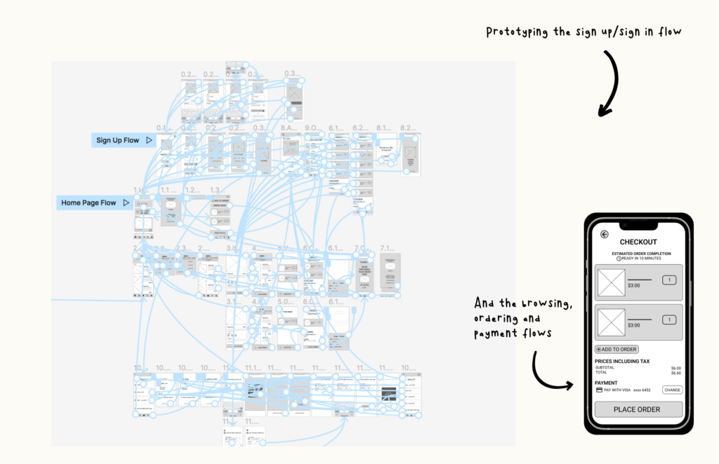
Low-Fidelity Prototype
Usability Study
40 minute
moderated usability study
with 5 participants
Each session included
- a short introduction
- a list of tasks to be completed
- a SUS survey
Participants reside in
Tokyo, Japan or Melbourne, Australia
Research Goals
- Figure out if the app makes it clear and easy for users to make informed food choices
- Confirm if the experience of ordering through the app saves time and exceeds/improves on the usual in store ordering experience
Research Questions
- Does ordering through the app provide a more efficient, more useful
experience than ordering in-store? - Are users able to easily find the information they need to make informed
dietary decisions? - What can we learn from how the users navigate through their search and
order process?
Methodology
Participants included
Users who eat lunch out or buy lunch outside the home at least twice per week
Parents, working individuals
individuals with specific dietary requirements or preferences (E.g. vegan, no seafood, gluten allergy etc)
The participants included
Native Japanese
Non-native participants with a range of Japanese language ability
Users were given 6 Tasks to complete within the prototype.
The purpose of the tasks to see how users managed the Sign Up Flow, Search Flow, Order & Payment Flow and Log Out Flow
Users also completed a System Usability Scale Questionnaire
Implementing Research Findings - Dietary & Allergen Filters
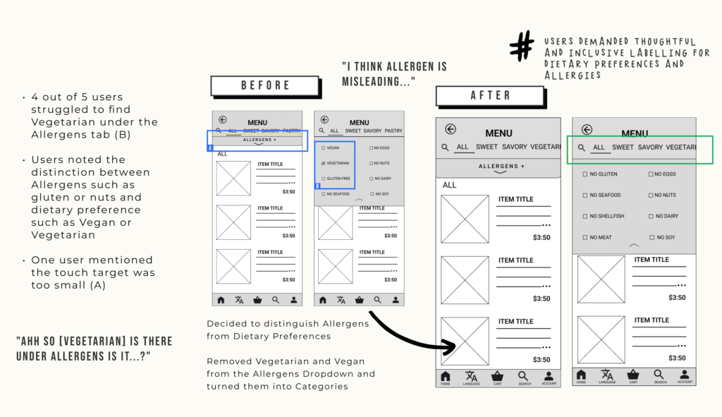
Implementing Research Findings - Icons & Labels
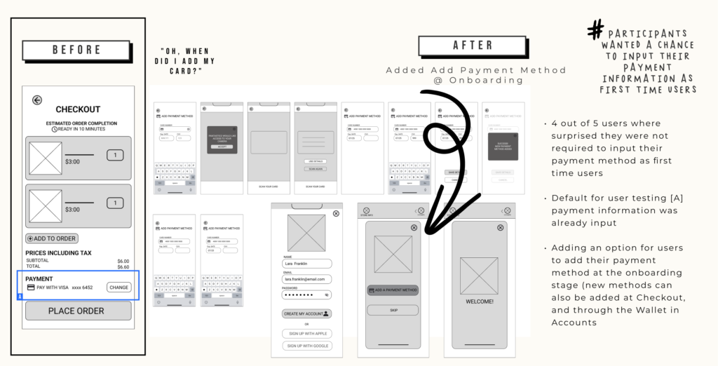
Implementing Research Findings - Adding Payment Methods
Refining the Design
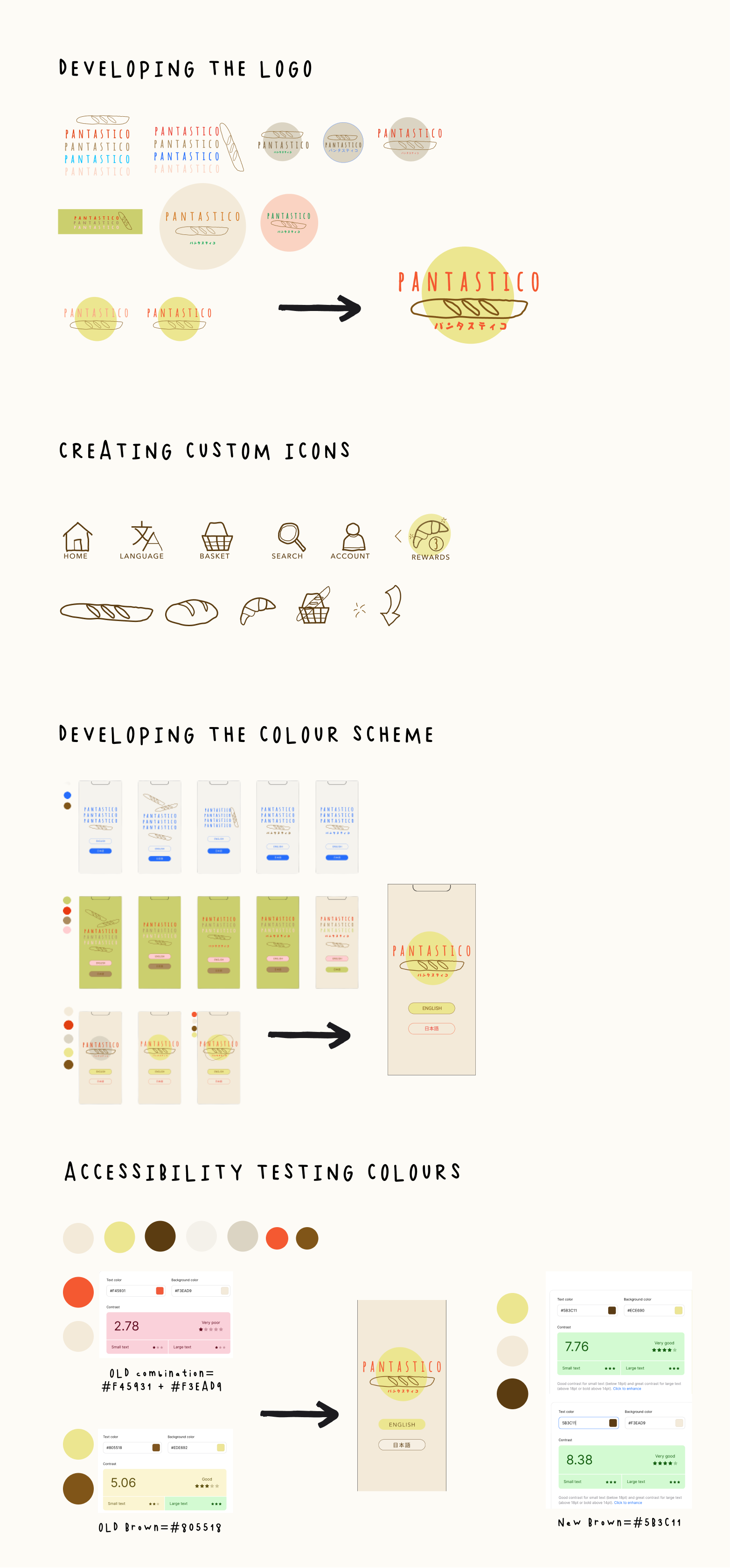
UI Considerations

Mockups
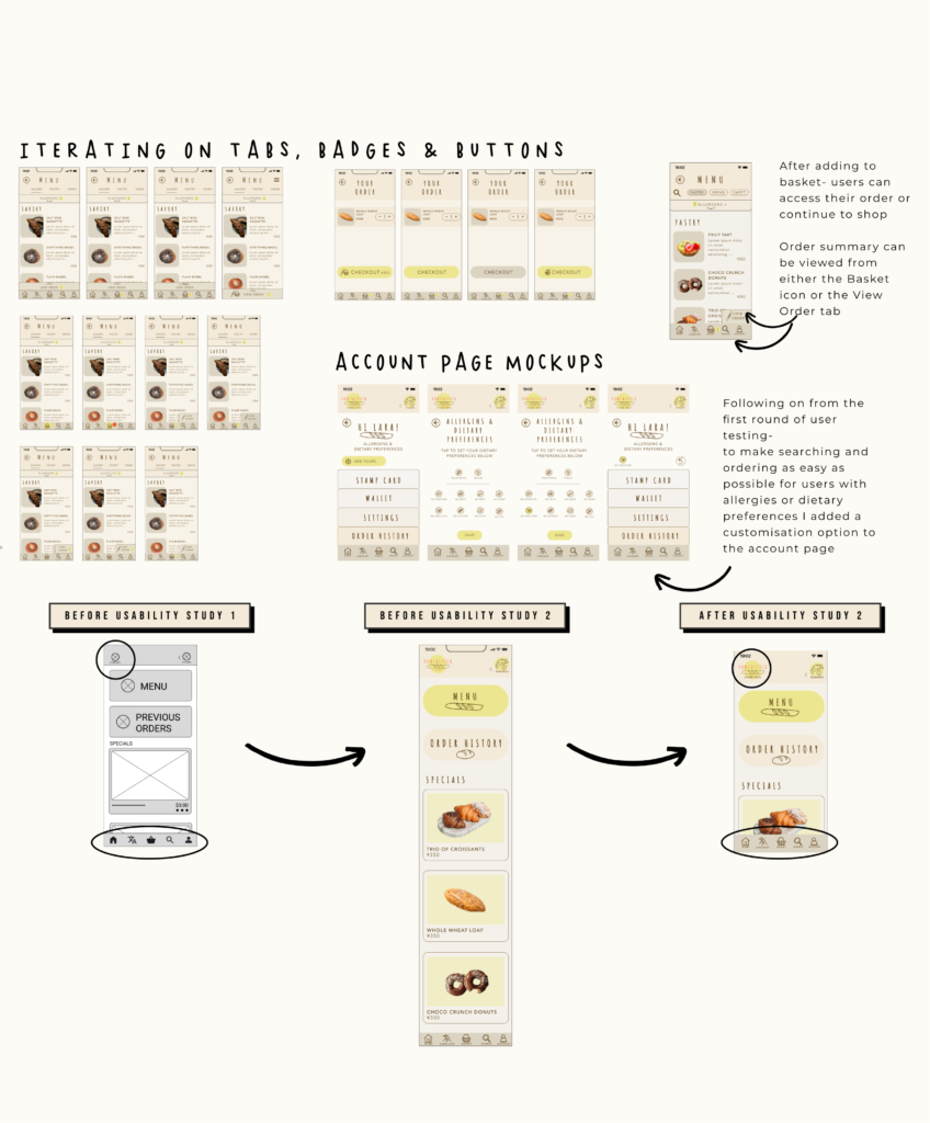
Mockups
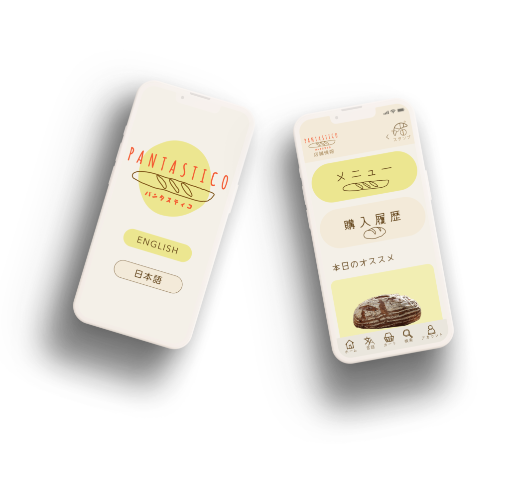
High-Fidelity Prototype
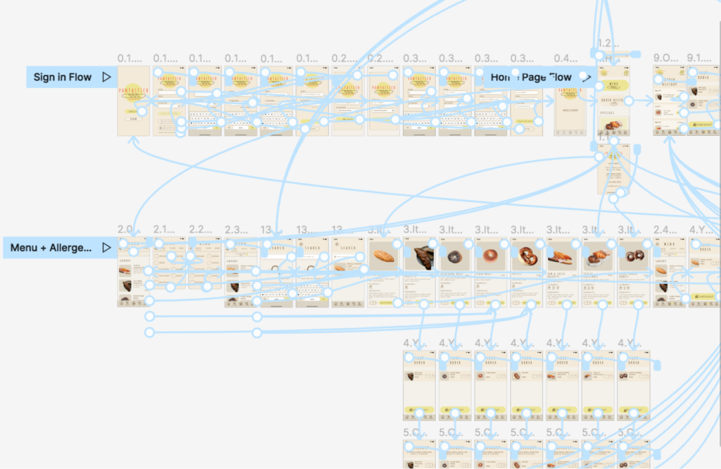
This version of the high-fidelity prototype was used for a second round of Usability Testing.
This version allowed us to test the sign up, sign in and sign out flows, as well as adding new payment methods to the wallet and changing the payment method at checkout.
This version also addressed findings from the first round of testing regarding labels for all icons and buttons, spacing in the bottom nav bar and the distinction between Allergens and Dietary Preferences for filtering the menu.
Accessibility
Conducted accessibility testing on colours and contrast for better visibility
Added text labels to all icons to make the meaning easier to understand and created icons to make navigation and allergen identification easier
Annotated designs with alt text for images to provide better access to users of screen readers
Going Forward
Takeaways
I wanted to create a digital experience that tapped into the warmth and personality of Pantastico while being inclusive and intuitive for even that most unfamiliar users.
Using the human centred design process was so important in staying close to the user through the entire process. I can definitely see this way of working, Empathise, Define, Ideate, Prototype, Test, (and Repeat), as being indispensable in future projects.
Testing with users of varying levels of familiarity with digital conventions was hugely enlightening.
It taught me how important it is to get a range of perspectives and not assume what the user experience will be. As designers, we can get too close to the work. Conducting multiple user tests allowed me to see how crucial new eyes and perspectives are in creating the best possible experience for the user.
The idea of constantly returning the personas helped to keep the ultimate goals of the user front-of-mind and maintain balance with what can at times be the competing interests of the business.
Getting away from assumptions and empathising with users revealed great insights, providing areas to further iterate on and refine which may have otherwise been missed.
Next Steps & Areas to Refine
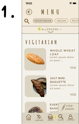
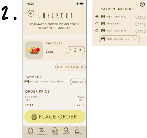
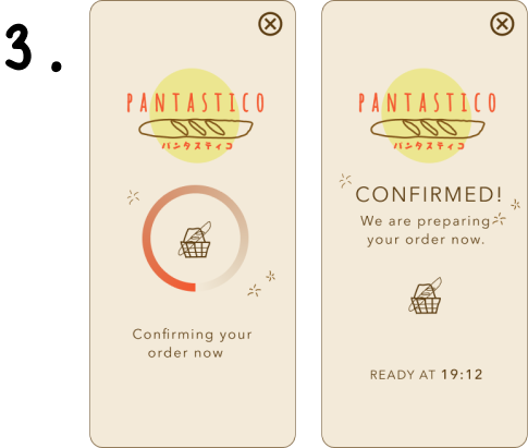
Hi-fi usability testing demonstrated the Pantstico App was, overall, doing a great job of addressing the challenges we set out work on. Through the testing we could see that we were meeting key KPIs and addressing the pain points around time, language and diet & allergens.
That said, the testing also revealed some key areas of improvement in the design.
Going forward I will:
- Iterate on the view order tab to create better contrast and a clearer visual cues for the user
- Refine the change payment methods overlay to provide better feedback to user once they have selected the new payment option
- Rework the confirmation screen to provide more detailed information on the stamps they have earned and the process for collecting their order (potentially adding a pop-up to the home screen to revisit their order confirmation)

