Role
UI/UX Designer creating an online shopping experience for creatives.
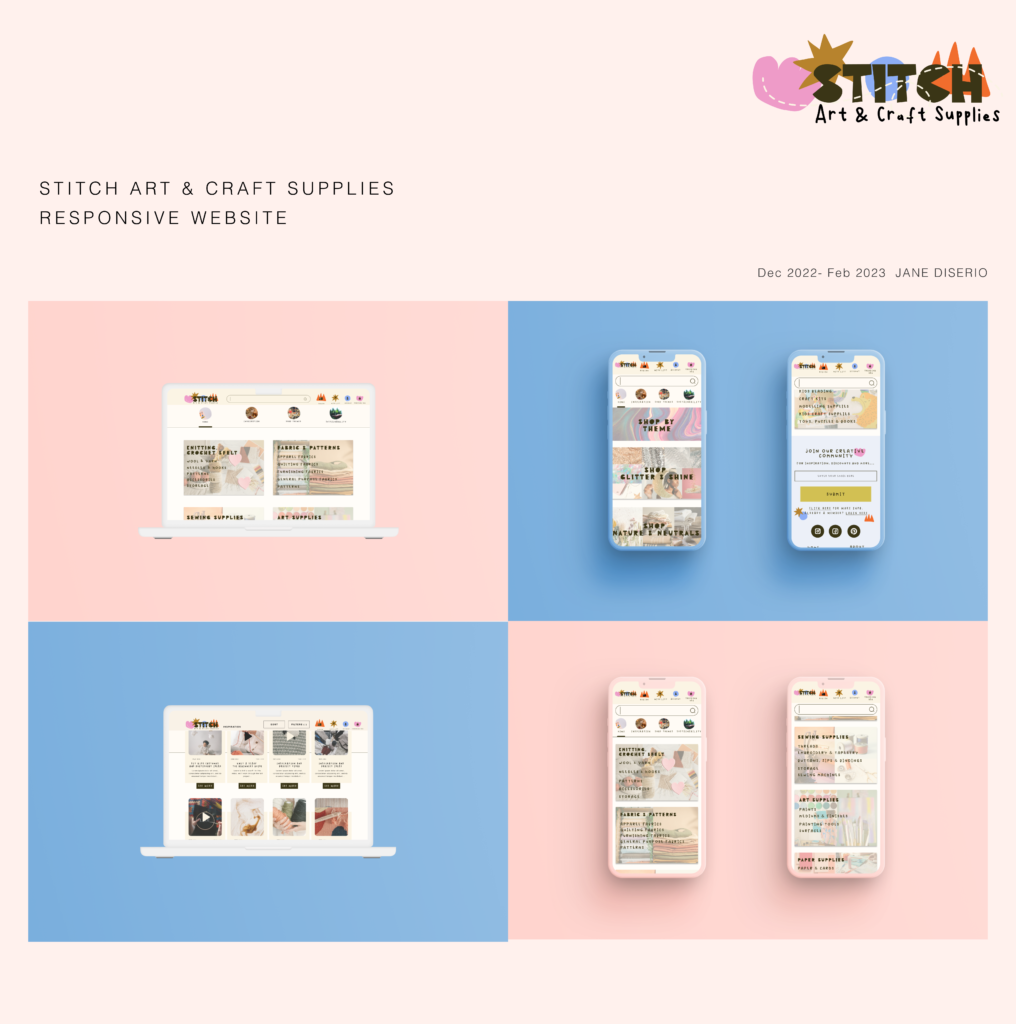
Designing the Stitch responsive e-commerce website from conception to delivery.
Responsibilities
- UX Research, interviews & usability studies
- Creating paper and digital wireframe, low and high-fidelity prototypes
- Accounting for accessibility, and iterating on designs
- UI Design decisions, branding, logo & icon design

The background
Available online shopping websites for arts and craft supplies overwhelmingly have confusing, cluttered design, inefficient filters and a lack transparency about how the products are sourced and their environmental impact.
The Challenge
Design an online shopping experience for Stitch which expresses a strong brand identity, with an inspiring and intuitive user experience flow and effective filters and search capability
Competitive Analysis

I looked at several potential competing companies, two direct competitors and two indirect competitors. These companies would be playing in the same space as Stitch and would potentially infringe on the business’ revenue & popularity.
After ordering the web and online shopping experience of these competitors it was clear that Stitch has the opportunity to distinguish itself by bringing together a range of products to create a one-stop shop without over-saturating the user’s selection or creating a cluttered, overwhelming online experience.
The key areas of improvement across competitors I noticed which Stitch can address are;
– Poor accessibility (lacking Alt text, insufficient touch targets, poor contrast, unable to tab through the site)
– Cluttered or overwhelming UI
– Lack of filtering options
understanding the user
User Research
Initial Research- user interviews
Below is a selection of some of the questions we asked potential users in our initial explorative interviews
What’s your relationship like with online shopping?
What do you like about how you currently do that?
How do you currently go about shopping for craft supplies?
Tell me about the last time you tried to buy craft supplies
What role does craft play in your day to day life?
What are some of the apps and websites you use the most?
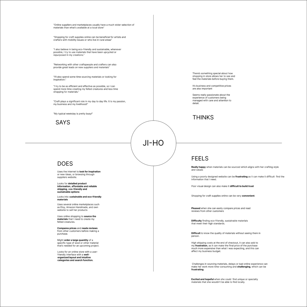
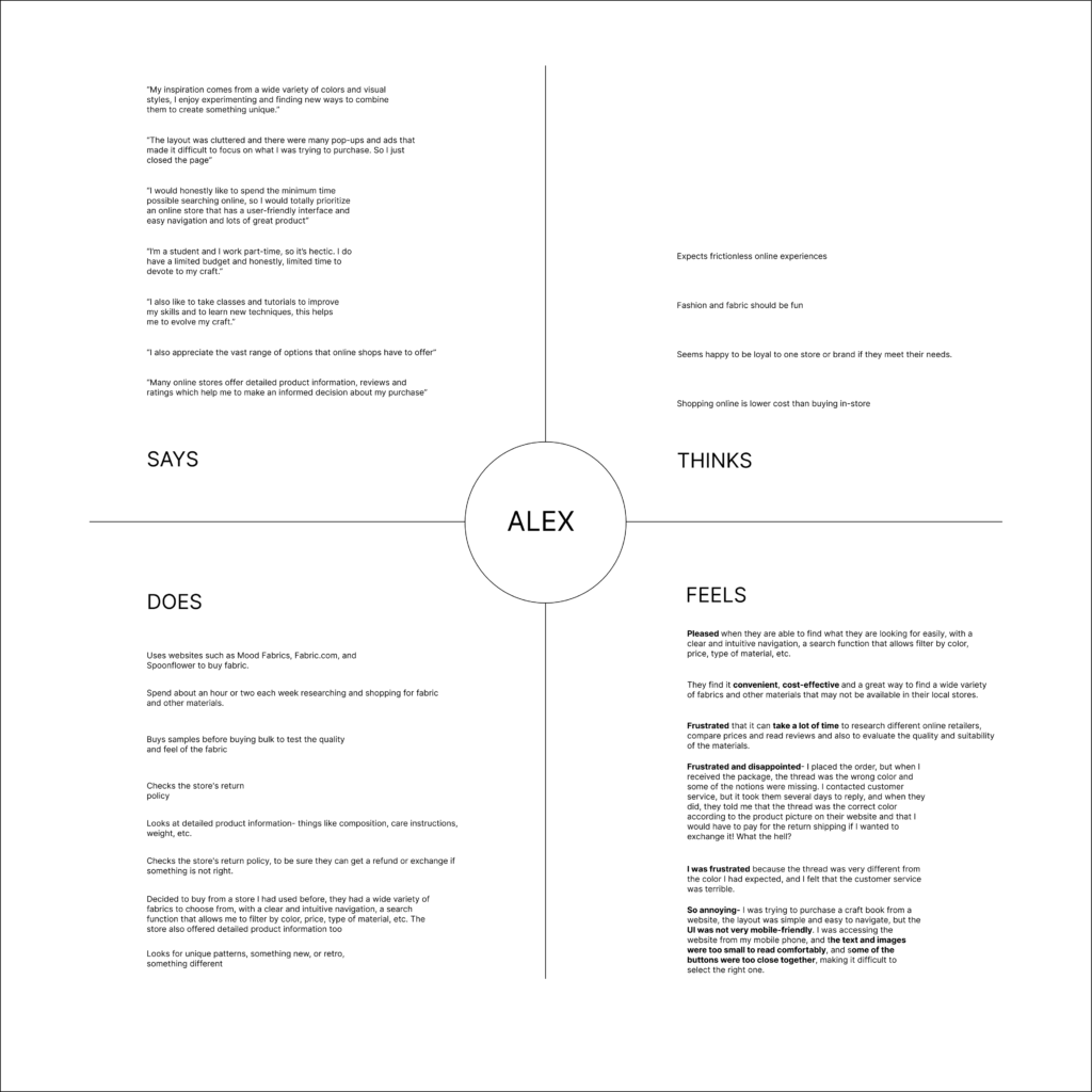
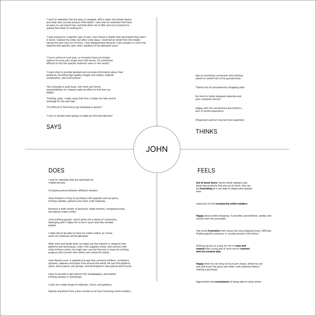
Empathy Maps
Pain points
Values and Ethics
Online shopping can feel murky and price driven. Artists & creatives are cognisant of sourcing products that align with their ethics and values.
Users want to be able to make ethical decisions about the products they are buying. Including knowing if products are eco-friendly, made locally or ethically sourced.
product information
Users felt the digital shopping experience didn’t do enough to meet expectations set by shopping in-person.
They want detailed images, close-ups, video content, care instructions, and clear product descriptions and details on the yardage, fibres etc.
A lack of transparency and customer service was a key pain point for online shopping.
Filters & Search Function
Not being able to find what they are looking for, having to sift through too many products because of poor filters was another key pain point.
Users also mentioned that looking for inspiration when they needed something but didn’t have a specific product in mind was often difficult on existing websites.
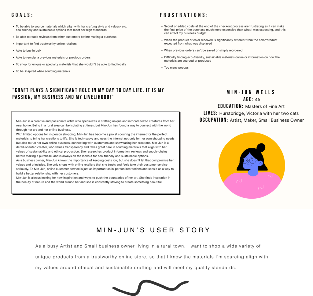
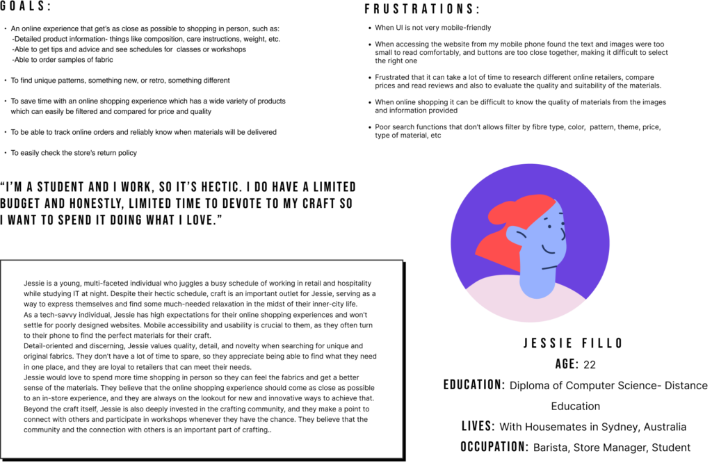
User Personas
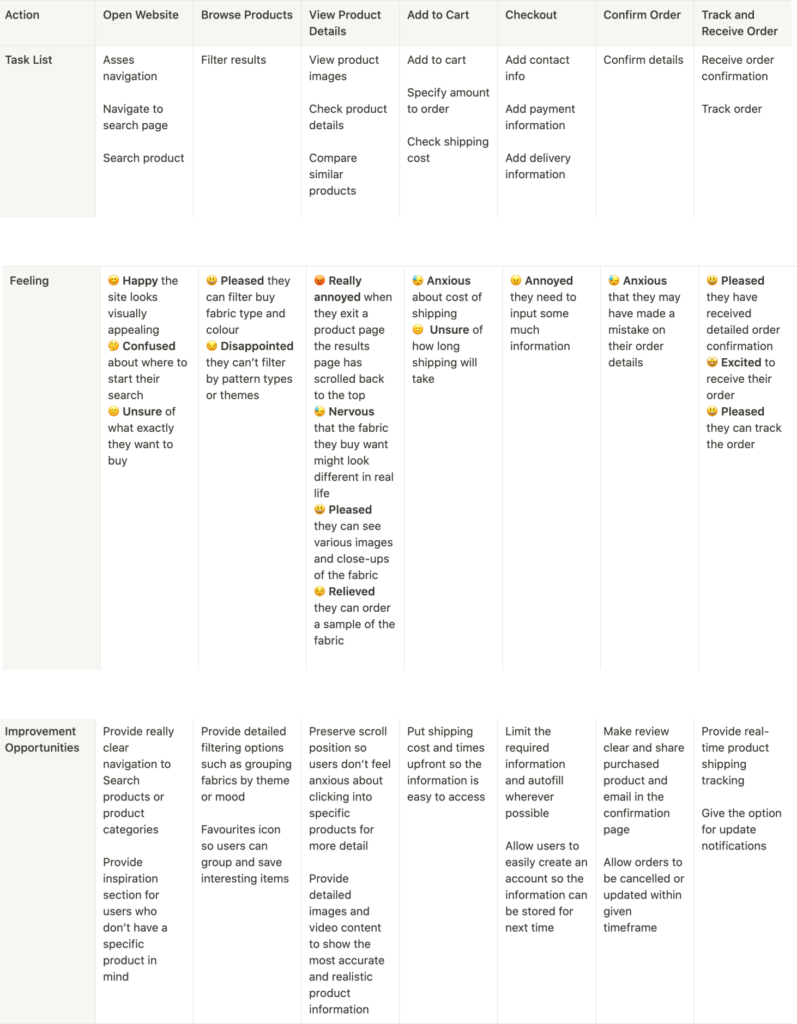
User Journey Mapping
Jessie’s Problem statement
As a tech-savvy student working two jobs I want a simple, mobile friendly platform with detailed search filters and product information, so I can shop for fun and unique fabrics and supplies anytime, efficiently from my phone.
starting the design

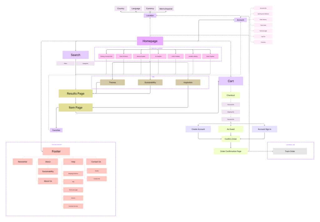
Site Mapping
Paper wireframes

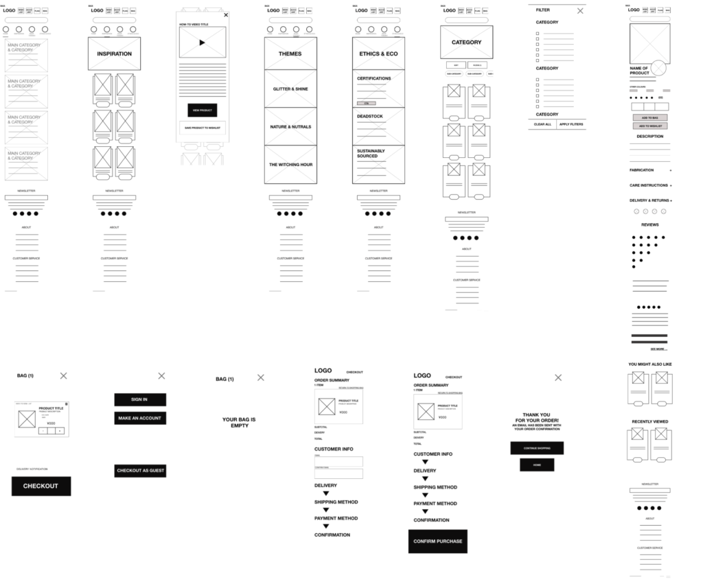
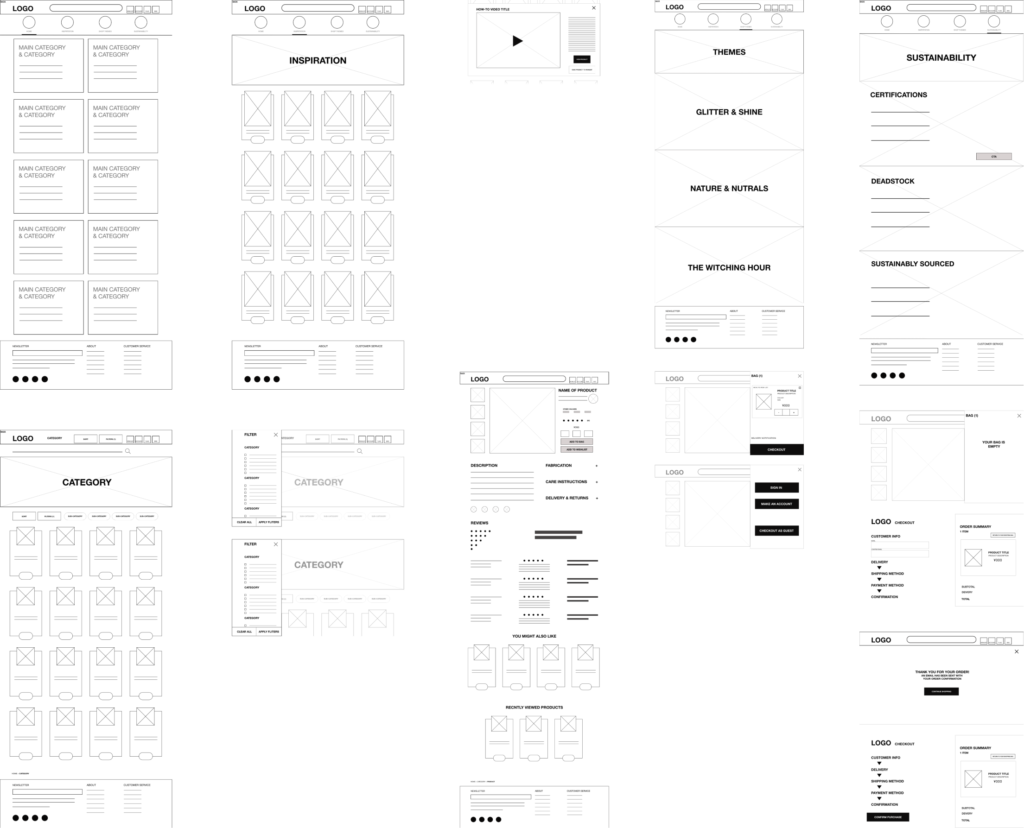
After sketching out various possibilities and wireframes using crazy eights I moved on to digital wireframes where I reviewed what was necessary, unnecessary, and what areas needed improvement. I spent time on this step to refine the user flow and make sure I had a clear vision for the underlying UX before moving onto the visuals.
Digital Wireframes
mobile
Desktop
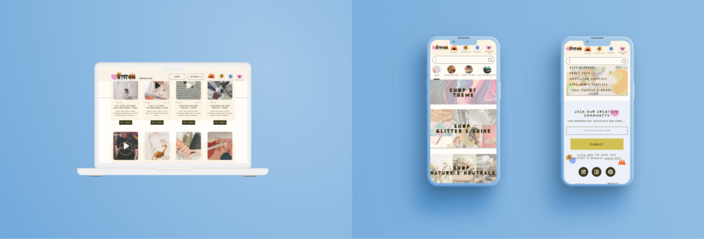
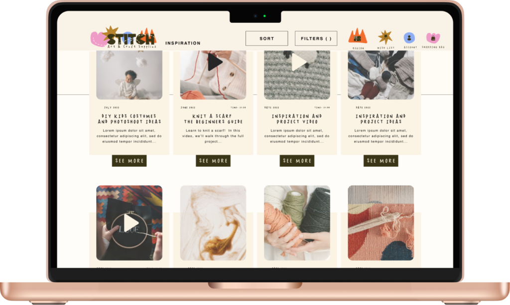
I created two layers of navigation, one with a prominent search bar (since this is often the first way users looked for specific product) and icons that easily allow users to sign in, view their wishlist or cart, change their currency and language preferences as well as return home via the logo image.
The secondary nav is for moving between the main pages. This allows the user to easily explore, encouraging them to search for inspiration, thematic shopping and information on sustainability without losing their way.
Usability testing
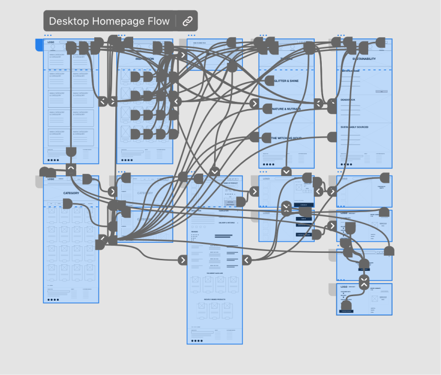

In a moderated usability study I tested the user flow for browsing products, adding and removing from the shopping bag, taking the product to checkout and checking out as a guest.
Findings

add to cart
Users want a way to quickly add products to their cart from the Category search page without having to click in to individual items.

Sort & filter buttons
Users felt it wasn’t necessary to have two separate places to sort or filter on the Category search page, they found it confusing.

Checkout
Users value a super simple checkout process. They want to limit the amount of information they need to input. Autofilling location information from the post code could be a great way to address this.
implementing research findings
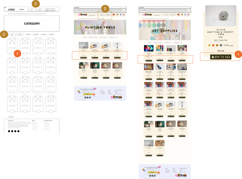
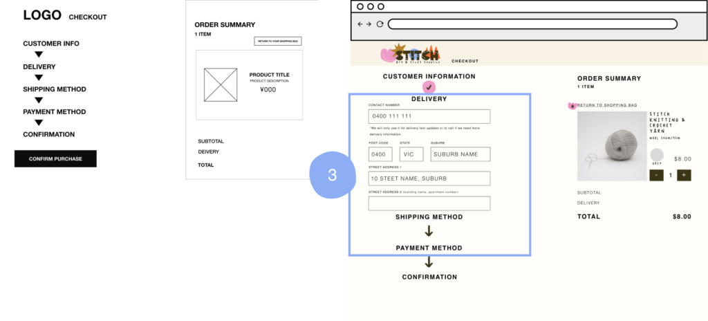
Refining the Design

UI considerations
Mood Board
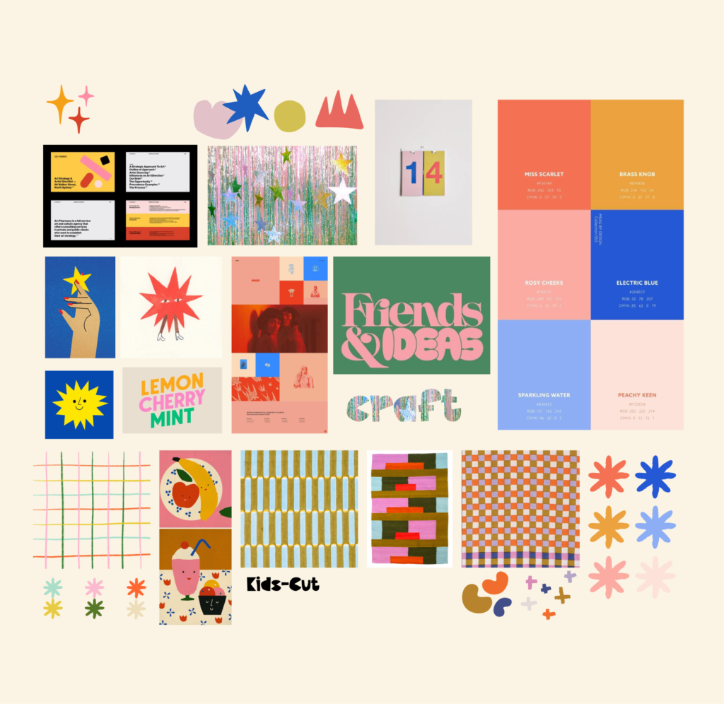
Letterform

Developing the logo

<span data-metadata=""><span data-buffer="">Developing Icons

I decided to create a set of icons to be used for labelling products so users can easily identify items that align with their values.
Detailed information can on these can be found on the sustainability page.
Mockups
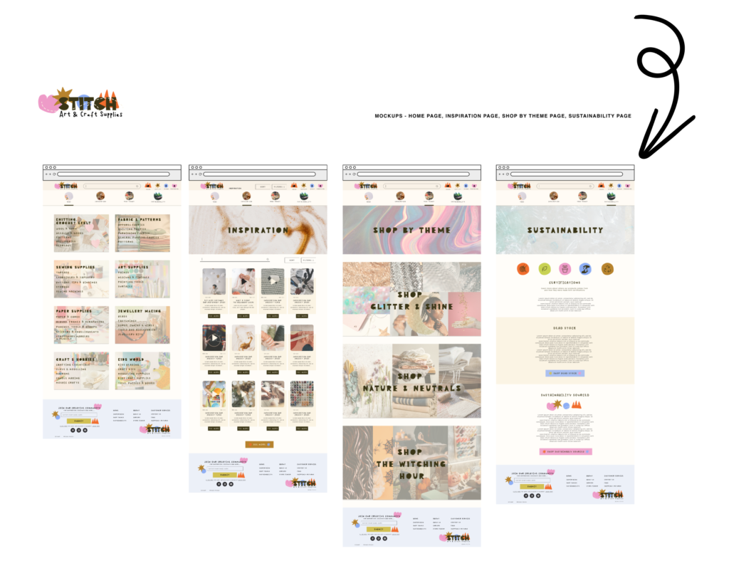
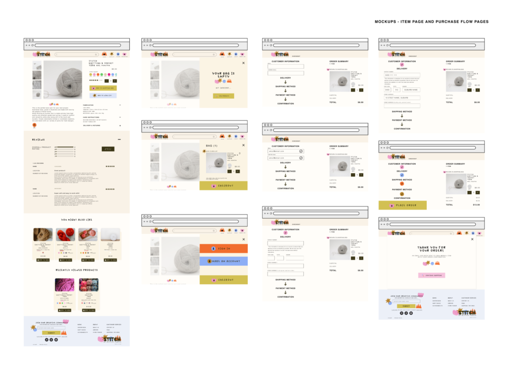
Key Mockups
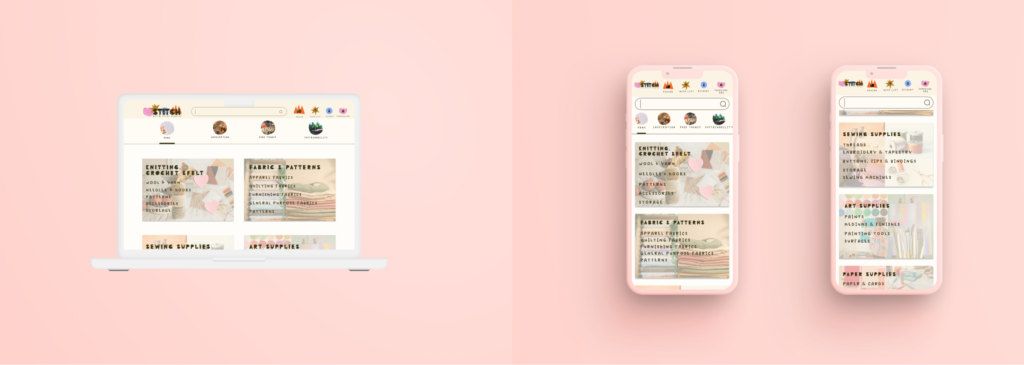
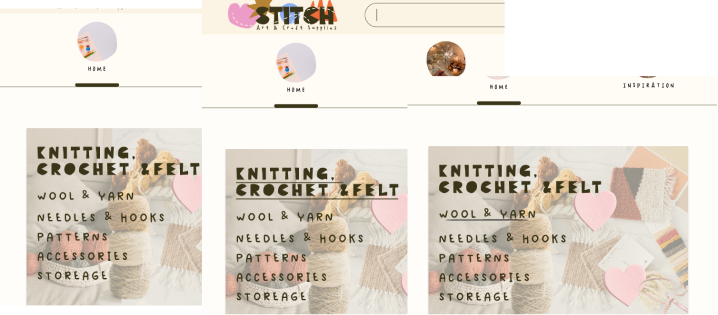
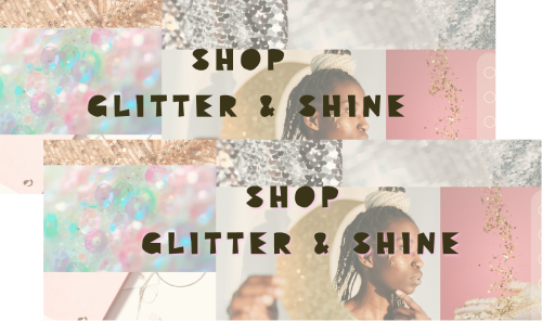
Underlines & coloured shadows
high-fidelity prototype
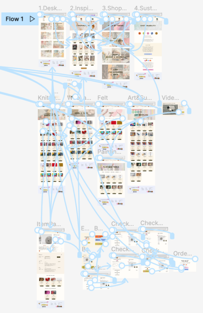
The hi-fi prototype followed the same overall flow as the low-fi but with more detailed screens for the checkout process.
I included changes made in accordance with the earlier testing on the lo-fi prototype related to checkout, filter and sort buttons and add to cart buttons on the item tiles.
I also added hover states to some elements to make it easier for users to understand that content was clickable and encourage interaction.
Accessibility

Added annotations to make it clear how users will be able to Tab through the site

Annotated designs with alt text for images to provide better access to users of screen readers

Added text labels to all icons to make the meaning easier to understand and created icons to make identification easier
going forward
Takeaways
After I conducted the competitive audit for Stitch it became clear that there is a market for an all-in-one Art and Craft online store with a clear and functional design with style and character.
However, the project also proved there are many challenges in balancing the visual impact of a design with the functional usability of the design. Returning to initial user interviews and conducting usability studies was essential to achieving this balance. I saw how easily visual design decisions can overtake usability concerns when there isn’t a strong UX framework in place from the earliest stages of wireframing.
I was reminded that it is so important to continue to return to the user personas and the insights gained at the beginning of the project to make sure the product continues to address original pain points and product goals, even as the product journey continues to evolve.
I also learned that the devil is in the detail when it comes to refining the user experience. Small tweaks and changes can have a big impact when it comes to keeping users on the ‘happy path’ from the moment they open the site to when they make their purchase. There is still room for Stitch to improve the purchase flow for users, which can often be the most stressful part of the user flow for e-commerce websites.
NEXT STEPS & AREAS TO REFINE

Hi-fi usability testing revealed that the site was doing a good job of addressing initial pain points related to providing product information and inspiration. However, there is still more that can be done to improve the checkout process as well as the item page.
Going forward I will-
- Remove the quantity button from the checkout page at payment method to avoid confusion
- Add an option to save and make an account at the end of checkout (users liked the option to checkout as guest but wanted a simple way to save the information they entered if they change their mind at the end of the process)
- Iterate on ways to incorporate an easy click button to add a sample to the shopping bag (users want a way to order a sample of the product for products like fabric)
- Re-work the item page so users can see information on shipping costs as early as possible
